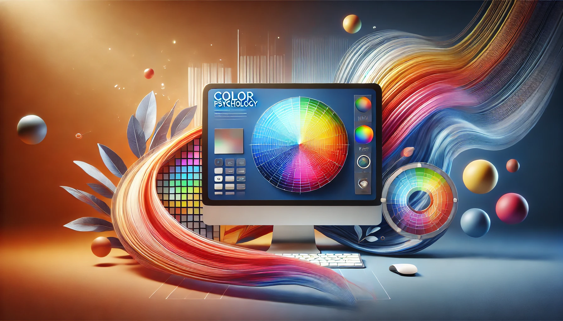
Color is far more than a decorative choice for your website. It acts as a powerful conduit for emotions, perceptions, and brand storytelling. When you land on a website, you often make immediate judgments based on color schemes before you even scan the text or explore the navigation. In web design, these judgments can translate into how trustworthy, approachable, and engaging a brand appears. Studies have long indicated that consumers rely heavily on visual cues, particularly color, to form their impressions of a product or service. This means that the right or wrong selection of colors can impact the trajectory of user engagement, brand loyalty, and ultimately, conversions.
Vadimages Web Development Studio understands how important it is for a business to communicate effectively through color. In a digital world overflowing with websites, apps, and online platforms, there is little room for bland or counterintuitive color choices. Our team at Vadimages has spent countless hours fine-tuning the color palettes for clients across various industries, ensuring that each brand message shines through the design. This blog post will unravel the significance of color psychology in web design, guide you in aligning those colors with your brand identity, and highlight how consistency builds trust in your audience.
Beyond theory, color psychology is also about cultural nuances and human emotional triggers. While red may signify passion or urgency in many Western cultures, it might symbolize good luck in Eastern contexts. Such subtleties cannot be overlooked when planning a global marketing or brand strategy. Understanding the undercurrents of color ensures that your brand resonates with the widest possible audience, leveraging color associations to build meaningful connections.
The Emotional Influence of Color in Web Design
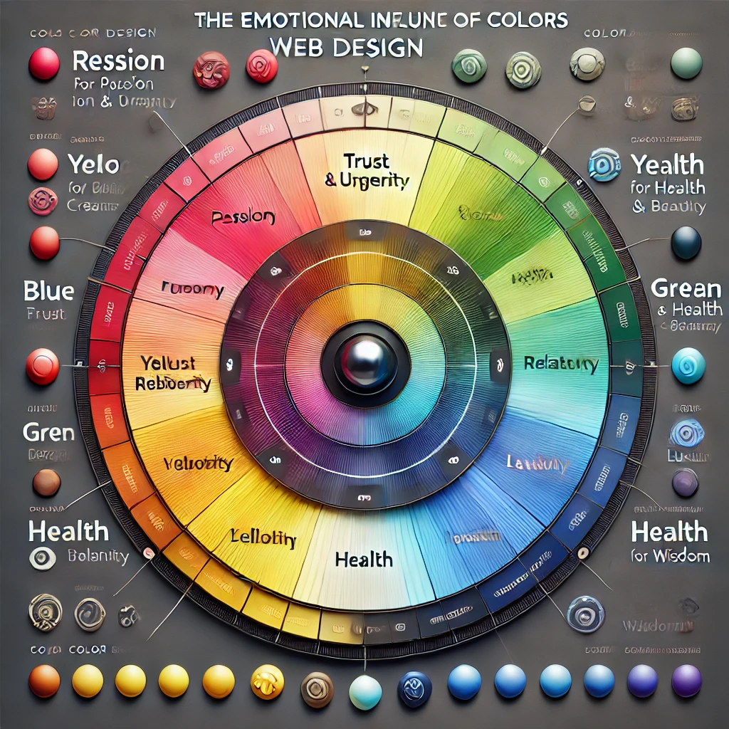
Color triggers emotional and psychological reactions, often at a subconscious level. People may not realize it, but the reason they linger on one website and rapidly exit another can be partially traced to how comfortable or intuitive the color scheme feels. Warm colors like red, orange, and yellow can create sensations of vibrancy, energy, or urgency. Cooler hues such as blue, green, and purple often evoke calmness, reliability, and creativity. These associations are not random; they have been observed, studied, and documented across behavioral and marketing research.
When a visitor lands on your homepage, the banner or hero section typically occupies prime visual real estate. The color choices in that area can immediately set the mood. A finance or technology website might opt for various shades of blue and gray to reflect stability, trust, and innovation. An organic skincare brand might integrate greens and earthy tones to communicate nature, health, and sustainability. The central idea is to match emotional triggers with the brand’s core values and the user’s expectations.
Brand perception goes beyond mere attraction. If your website sells high-end fashion, a muted, sophisticated color palette can hint at luxury and exclusivity. Using overly bright, clashing colors might convey a sense of casualness or youthfulness, which could contradict the essence of a luxury brand. Similarly, if you’re targeting children’s products, a playful palette with brighter tones might be far more effective, as it resonates with an audience that appreciates cheerfulness and fun.
Cultural context also comes into play. While white is often associated with purity in Western cultures, it can symbolize mourning in others. A brand targeting an international audience must be aware of the symbolic weight color carries in different parts of the world. By proactively studying these nuances, you can avoid unintended missteps that could alienate potential customers.
These considerations are not confined to backgrounds and headings. Designers also need to think about how color influences the action elements on the website, such as call-to-action buttons, forms, and navigation menus. A button in a contrasting color can guide a user’s eye directly to the place you want them to click, but if that color also evokes feelings of danger or discomfort, it may create hesitation. Subtle variations in saturation, brightness, and hue can dramatically shift user behavior. By working methodically and testing different color variations, brands can hone their websites for optimal engagement.
Aligning Colors with Your Brand Identity
A successful web design doesn’t randomly pick a color palette. Instead, it stems from a brand’s personality, mission, and overall visual language. Building a color palette starts with understanding your brand identity. If your brand is known for creativity, using bold contrasts and unexpected color combinations can underscore that imaginative spirit. If your image is rooted in tradition and heritage, subdued tones or timeless color schemes can reinforce that narrative.
At the core of brand identity lie elements like your logo, typography, and brand guidelines. These components interact with color to form a cohesive design. Consider how the color of your logo can determine or at least heavily influence the rest of your palette. A bright and sunny logo might look out of place on a website drenched in dark, somber shades, unless there is a strategic intention to create that contrast for dramatic effect. Consistency across all channels, including print materials, social media graphics, and signage, cultivates a sense of familiarity and trust.
Color is also important in shaping user pathways. If your brand is particularly vibrant, you might use those signature colors sparingly so they stand out against neutral backgrounds. This approach can help key elements like calls to action or important product highlights pop into the user’s focus. On the other hand, if minimalism defines your brand, integrating white space and subtle color transitions can create an environment of understated elegance. The challenge is striking the right balance, ensuring that your brand colors neither overwhelm nor underwhelm the user.
When deciding on the final palette, testing is invaluable. Gathering feedback through usability studies or A/B testing can reveal whether users find a certain color pleasing or off-putting. Audience segments might have unique preferences, especially if you operate in multiple markets or industries. The insights gleaned from such tests can inform revisions to color choices or the broader web design concept. Iteration is often part of this journey. The color scheme you start with might not be the one you end up implementing if you discover certain issues with readability, cultural connotations, or brand mismatch.
At Vadimages, we’ve found that small tweaks in color—such as adjusting the shade of a primary color by a few degrees—can make a significant difference in how users feel and behave on a website. Our process often involves multiple design prototypes to capture the nuanced interplay between color, typography, and layout. We consider emotional cues, brand alignment, and user experience fundamentals to craft color strategies that help businesses like yours stand apart in competitive digital landscapes.
Achieving Cohesion and Consistency
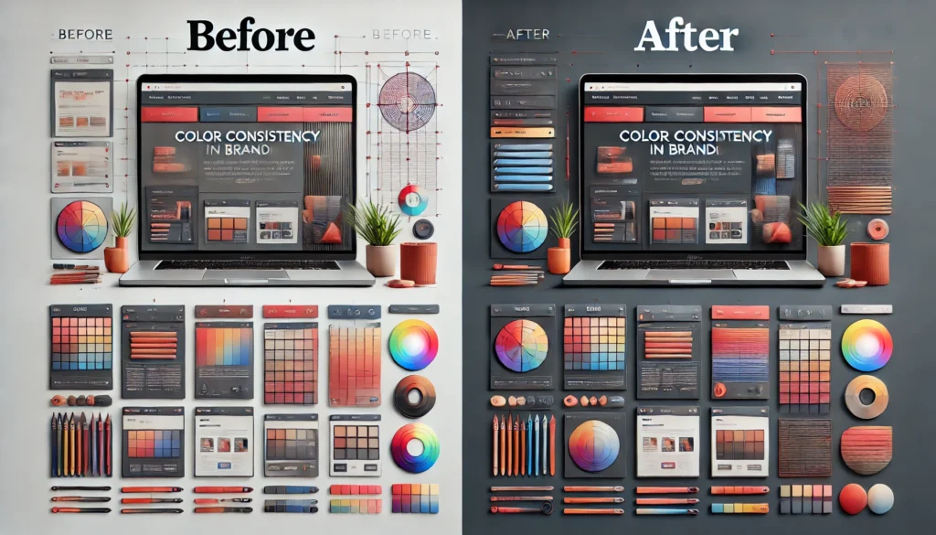
A cohesive color scheme means your brand looks and feels the same across every page, landing, or subdomain. Visitors should not be confused about which website they’re on or which brand they’re engaging with. Cohesion isn’t about using the same exact shade everywhere; rather, it involves harmonizing accent colors, secondary colors, and background shades in a way that everything feels unified but not monotonous. An accent color might appear in headings or icons, while a secondary color takes on a role in navigation elements.
At the same time, maintaining consistency doesn’t mean sacrificing creativity or variety. Strategic variation in color can emphasize new sections, highlight updates, or guide user attention to calls to action. Designers often utilize color theory principles, like complementary or analogous color schemes, to ensure that variations remain visually pleasing. A monochromatic approach can also work for minimalist brands seeking a sleek, modern look, provided that each shade is purposefully chosen to differentiate content sections.
Even with a sophisticated color scheme, your website should be accessible. Some users have color vision deficiencies, and ignoring their experiences can alienate a portion of your audience. Ensuring enough contrast between background and text improves readability for everyone, not just those with visual impairments. Paying attention to color contrast guidelines can also enhance the overall aesthetic, making design elements look sharper and more intentional.
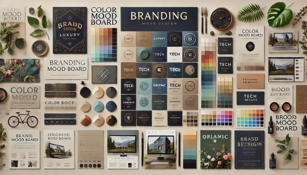
Incorporating graphical elements is a highly effective way to underscore your brand’s color palette. Imagine a diagram or banner that showcases your primary and secondary colors arranged in a stylized color wheel. This visual reference can guide users in understanding your brand’s core values at a glance. Another approach could be an interactive color mapping graphic placed on your About or Brand Story page, where visitors can hover or click to learn how each color ties into your mission and values. These creative design choices allow for storytelling that goes beyond text, transforming your brand colors into a narrative device.
Below is a conceptual example of a color wheel diagram that might appear on a design-focused website. It visually arranges warm and cool tones, with your brand’s primary color at the center. Each slice could be labeled with text describing the emotional connotation of that hue. This visual approach not only helps visitors understand the rationale behind your brand palette but also leaves a memorable impression of thoroughness and intentionality.
         (Warm Tones)
             Red
              |
  Orange  ——— [Brand Color] ———  Purple
              |
             Blue
         (Cool Tones)
In such a layout, the brand color stands as the defining element, linking all complementary or analogous colors around it. By illustrating the choices your brand has made, you create transparency and a bit of educational content that visitors can appreciate. This also helps establish trust and positions you as a knowledgeable, detail-oriented brand.
Many businesses fail to realize that color consistency goes hand-in-hand with professional appeal. When your online storefront, marketing emails, social media posts, and print materials all convey a unified color experience, potential clients are more likely to view you as authoritative and reliable. The psychological effect of consistency fosters brand recall. People start associating your particular shade of green or blue or red with your offerings, values, and style. Over time, this association cements your identity in the minds of consumers, translating into loyalty and advocacy.
If you ever find yourself in need of expert guidance to refine your existing color palette or to develop one from scratch, remember that Vadimages is here to help. Our web development studio prides itself on delivering thoughtful, research-driven design solutions. By partnering with us, you can alleviate the guesswork and benefit from a meticulous, comprehensive approach to color. We ensure that every hue on your site aligns seamlessly with your brand message, setting you up for lasting success in the digital sphere.
When you are ready to transform your website’s visual identity and make a bold, memorable statement through color, Vadimages is prepared to provide custom solutions for your brand. Our expert team brings years of experience in web development and design, using color psychology to shape user perceptions and craft memorable online experiences. Visit Vadimages to learn how we can help you build a site that captivates visitors at first glance and keeps them engaged for the long haul.
Whether your brand image is innovative and vibrant or traditional and timeless, color lies at the heart of web design’s power to influence. Deliberate, research-backed palettes can speak volumes about your brand. By understanding color psychology, aligning hues with your identity, and ensuring cohesion across platforms, you create an environment where visitors feel intuitively connected to your brand message. The next time you embark on a web redesign or launch a new product, remember that color is more than a stylistic detail. It is a foundational element that shapes user emotion, invites exploration, and ultimately forges enduring brand relationships.