Introduction
The world of web design never stands still for long. As the internet becomes more ubiquitous and digital experiences continue to evolve, businesses and brands are challenged to stand out in an increasingly crowded marketplace. Web design is no longer just about putting information online; it now revolves around storytelling, user engagement, and clear brand communication. That is precisely why forward-thinking studios like VadImages Web Development Studio continually research and adopt the latest techniques to ensure their clients’ websites leave a memorable impression. While it can be tempting to jump on every new idea that surfaces, not all trends hold the same transformative power or long-term value. The trends that prove most impactful are those that serve the end users’ needs while also amplifying a brand’s core message.
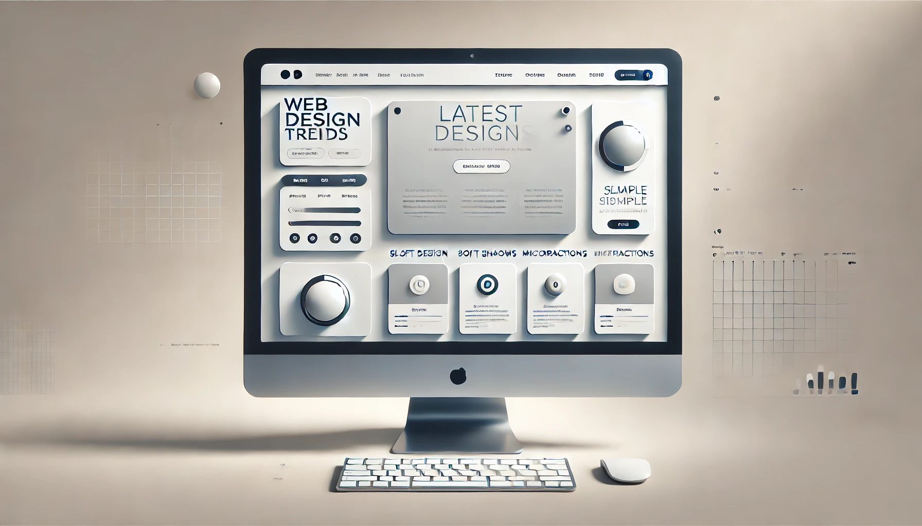
In today’s design landscape, minimalism, micro-interactions, and bold typography are emerging as powerful creative forces. They shape the way a site looks, feels, and performs, helping brands stand out when used judiciously. These three design approaches offer unique benefits, from enhancing clarity and intuitive navigation to fostering emotional connections and trust. Websites that employ these concepts often strike the perfect balance between functionality and aesthetic appeal. They provide the visual and experiential consistency that modern audiences demand, while also promoting a memorable user experience that encourages visitors to return. Embracing these trends can be the catalyst that propels a brand to new heights, allowing businesses to communicate more effectively and position themselves as leaders in their industries.
The Rise of Minimalism
Minimalism, as a design philosophy, has been influencing various creative fields for decades. In web design, it has grown from a fringe concept into a mainstream standard that many leading websites employ. At its core, minimalism involves focusing on essentials and stripping away excess elements. This means removing needless ornaments, large blocks of dense text, and any clutter that distracts from the primary goal of the site. By leveraging white space and only including the most necessary content and features, minimalistic websites create a sense of calm and clarity. The user’s attention is guided more purposefully, allowing them to focus on a product, service, or message without the friction that arises from excessive or irrelevant components.
A crucial advantage of minimalism is the way it enhances usability and performance. Websites that rely on fewer elements can load faster, particularly when images and code are optimized. This speed is critical because users are increasingly expecting near-instantaneous page loads. A delay of even a second or two can impact how visitors perceive a site’s credibility. By contrast, a quick-loading, elegantly simple design sends an immediate message of efficiency and user-centered thinking. From an aesthetic standpoint, clean lines, generous spacing, and strategic color palettes emphasize the brand’s identity and create a modern image that is easy to scale across different devices.
Designing in a minimalistic way goes beyond just a visual style. It requires thoughtful planning of user journeys and site architecture. Every clickable element, piece of text, or media asset must serve a real purpose. Rather than cramming everything onto a homepage, minimalism nudges brands to distill what truly matters, making sure each interaction has value for the user. This uncluttered environment reduces cognitive load, helping visitors absorb information more easily, move through the website more swiftly, and ultimately convert at a higher rate. Companies that implement minimalism correctly can communicate authority by proving they understand both their audience and the best user experience practices.
VadImages Web Development Studio adopts minimalistic principles precisely because they speak volumes without saying too much. When done right, minimalism doesn’t look barren; it looks efficient. It places the brand’s story front and center and ensures that every single design choice, from color accents to navigation menus, contributes to the narrative. This cohesive visual language can boost recognition and encourage user trust. As digital users continue to reward clarity, navigability, and strong storytelling, minimalism will likely remain a pillar of modern web design for years to come.
Micro-Interactions as a Vital Tool
While minimalism emphasizes clarity and the removal of fluff, micro-interactions insert moments of delightful engagement that can elevate a user’s experience. These small details—such as subtle animations when a visitor hovers over a button, a gentle vibration when they complete a form on a mobile device, or a change in an icon when toggling a feature—might seem minor on the surface, but they significantly influence how users perceive a brand. The reason micro-interactions have become so widespread is because they offer instant feedback and keep users engaged without demanding too much of their attention or time.
The heart of micro-interactions lies in human psychology. People have an innate desire for interaction, and when they use a website, they are far more likely to feel confident navigating it if the site responds in intuitive, almost friendly ways. When a visitor clicks a button, any immediate visual or tactile cue that acknowledges the action provides reassurance. These small moments of interaction guide the user journey like signposts, confirming that certain steps are being completed correctly. Consequently, the entire experience becomes more conversational. It is not just a static page; it evolves into a dialogue between the user and the interface.
Micro-interactions can also strengthen brand identity by adding distinctive elements that feel unique and fresh. Sometimes a well-placed animation, color transition, or playful sound can speak volumes about a brand’s personality. It can bring to life attributes such as fun, reliability, or innovation. Properly deployed, these details help visitors remember the site long after they have closed the browser tab. However, there is a delicate balance between adding engaging micro-interactions and overloading a page with extraneous effects. Excessive or poorly conceptualized animations can frustrate users, slow down performance, and overshadow content. That’s why strategic planning is crucial. Designers must identify the key interactions where subtle feedback would genuinely benefit the visitor. The goal is not to bombard users with flair but rather to create moments of genuine utility and delight.
For a forward-focused agency like VadImages, micro-interactions are an essential component of modern user experience design. By enhancing a site’s overall responsiveness and illustrating a keen attention to detail, these small touches reinforce a sense of professionalism and sophistication. Users often judge a website’s quality based on how each interaction feels. If the design responds smoothly and accurately to user inputs, it fosters trust and a sense of seamless exploration. Micro-interactions blend naturally with minimalism; the open spaces and straightforward interfaces characteristic of minimalist designs set the stage for these engaging elements to shine. The brand’s message remains crystal clear, complemented by interactive flourishes that guide and reward the user in intuitive ways.
Standing Out with Bold Typography
The written word remains fundamental to online communication. Even in a world increasingly dominated by videos and images, text remains one of the most direct ways for brands to articulate their value propositions. What has changed significantly in recent years is the way typography is leveraged. Designers are moving beyond simple, conservative type choices and exploring more creative fonts, large-size text, and typographical hierarchies that instantly capture attention. Bold typography does more than just enlarge words on a screen. It can serve as an anchor for a site’s visual identity, and in some cases, it becomes the main design element that people remember.
In a minimalist design framework, typography can carry enormous weight because there are fewer images or ornamental details vying for attention. A distinct typeface or an oversized headline can immediately set the tone for the brand. It might convey elegance, modernity, playfulness, or authority, depending on the chosen style. By emphasizing specific words or phrases in an eye-catching manner, the designer can guide visitors to the site’s most important messages. This focus on bold text not only ensures that the user knows what to read first but also encourages them to continue scrolling to discover more about the brand or product.
Selecting a memorable font can help a website stand out in a sea of generic designs. When audiences see the same typefaces used everywhere, the uniqueness of the brand can become diluted. By carefully picking a distinctive font—perhaps a contemporary serif for a refined feel or a striking sans serif for a modern edge—designers can build a strong typographic brand language that resonates with target users. Such choices should always align with the brand’s persona and mission, ensuring that the user’s first impression is both visually compelling and consistent with what the brand stands for.
Bold typography also forms a symbiotic relationship with micro-interactions. A simple hover effect that subtly changes color, size, or spacing can breathe life into text, capturing attention and inviting exploration. Combined with minimalistic layouts, strong typographic choices ensure that each word stands out exactly as intended. Bold typography also benefits accessibility, as users with visual impairments often appreciate larger, clearer text that is free from excessive decoration. A carefully planned site typography hierarchy guides these users as they navigate, showing them which sections are most critical and where key information can be found. This inclusive approach is more than just a design trend; it reflects a mindful consideration of every potential user’s comfort and needs.
VadImages often prioritizes typography early in the design process because it unifies content and visuals. It’s one of the fastest ways to make a statement about a brand’s character. When visitors land on a page and see carefully chosen headings that jump out in a compelling way, it heightens curiosity about what lies below. As they scroll, the interplay between headlines, subheadings, and body text can create a smooth, captivating narrative. The brand’s story comes through clearly, delivered in a manner that is both aesthetically pleasing and functionally sound. This blend of style and substance leaves a lasting impact, prompting users to engage deeply with the website’s offerings.
Wrapping all these threads together, a website that merges minimalism, micro-interactions, and bold typography is positioned to create a lasting imprint on visitors. Such a design not only pleases the eye but also streamlines navigation, enhances usability, and establishes a brand voice that resonates. The objective is to deliver experiences that are delightful and memorable, something today’s digital-savvy users have come to expect. A meticulously crafted site sends a subtle but powerful message: this brand respects my time, understands my needs, and is willing to innovate in order to connect with me in a compelling way.
At VadImages Web Development Studio, the goal is to translate each client’s unique story into a digital environment that captures and holds attention. With minimalism, we reduce visual noise and put the spotlight on what matters most. Through micro-interactions, we build trust and add a dash of human warmth to every click, scroll, and tap. With bold typography, we underscore the brand’s message in a manner that is not easily forgotten. When woven together thoughtfully, these trends form the backbone of a modern, powerful digital presence. They serve as proof that effective design isn’t just about looking contemporary—it’s about shaping a website that remains relevant, engaging, and distinctly on-brand, no matter how quickly the digital landscape changes.