

Apple announced its first foldable on September 9, 2026, and the iPhone Duo goes on sale October 23. For most businesses that is a hardware story. For anyone who owns a website, it is a layout story — and a short deadline. The Duo is the first iPhone whose screen changes size while someone is using it, and the first iPhone that people hold in two completely different ways depending on whether it is open or shut.
Your site will not break in a dramatic, obvious way. That is the problem. It will render, and it will look slightly wrong in ways that quietly cost you conversions: a hero image that swallows the whole screen, a checkout button that sits where no thumb can reach it, a form that clears itself the moment someone opens the phone to see more of it. Below is what actually changes, and what to fix before the device lands in your customers' hands.
Two viewports, one device, no page reload
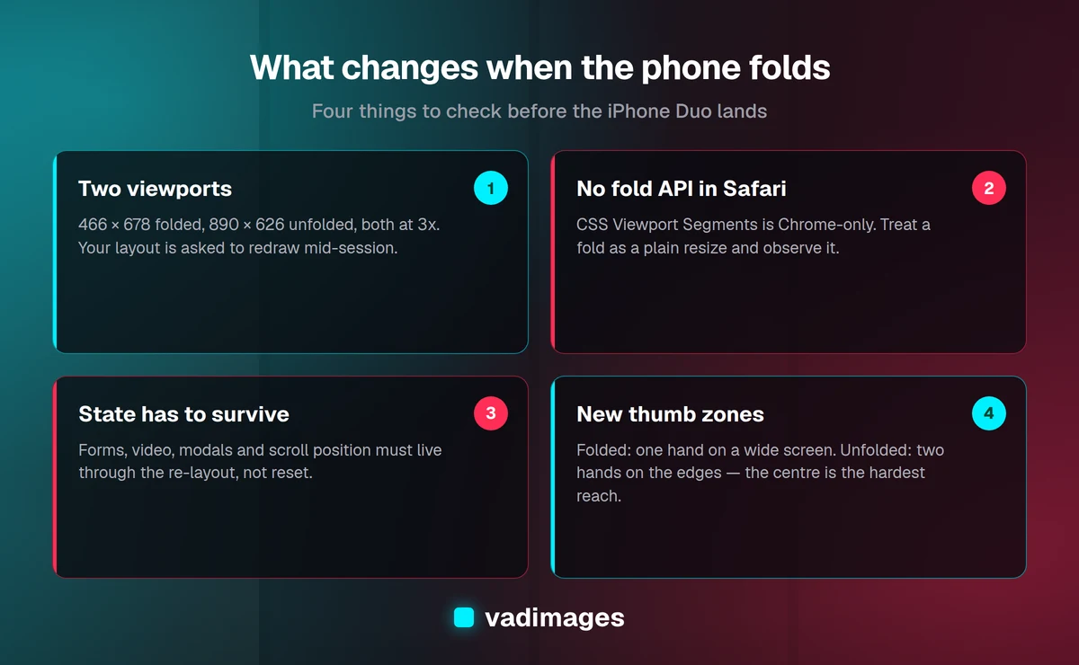
The Duo is a book-style foldable with a 5.4-inch outer display and a 7.6-inch inner display. In the terms your CSS cares about, that means two logical viewports, both at a 3x device pixel ratio:
- Folded (outer screen): roughly 466 × 678 CSS pixels.
- Unfolded (inner screen): roughly 890 × 626 CSS pixels.
Read those numbers again, because neither one looks like the phone in your pocket. A current iPhone is about 393 × 852 — tall and narrow. The Duo folded is wider and shorter than that. The Duo unfolded is wider than it is tall, at a height most developers associate with a small laptop window rather than a phone.
And the switch between them happens mid-session. No navigation, no reload, no orientation change event of the kind you are used to. Someone reads your pricing page on the outer screen, opens the phone to see the comparison table properly, and your layout is asked to redraw itself from 466 pixels wide to 890 pixels wide in a single frame — while preserving everything they had typed, scrolled, or selected.
The unfolded screen lands in your breakpoint blind spot
Most responsive sites are built around a handful of inherited breakpoints: 768px, 992px, 1024px, 1280px. An 890-pixel-wide viewport falls into the gap between "tablet" and "desktop," and whatever your framework does in that gap is what a $1,999 flagship user is about to see.
In practice we see three failure modes at that width. The first is a navigation bar that has already collapsed to a hamburger even though there is plenty of room for real links. The second is the opposite: a desktop navigation that expands at 880px and immediately overflows, because it was designed assuming a mouse and 1,200 pixels. The third and most common is vertical: layouts built for a tall phone stack into a single column with enormous section padding, and on a 626-pixel-tall screen the user gets one headline and half a paragraph per screenful. The extra glass they just paid for shows them less content, not more.
The fix is not to add an "iPhone Duo breakpoint." Devices will keep arriving with viewport sizes nobody predicted. The fix is to make your breakpoints follow the content: set them where your own layout actually starts to look wrong, test continuously across the range rather than at four fixed widths, and use container queries so a card, a table, or a form decides its own layout from the space it has been given instead of from the width of the window. A component that adapts to its container survives every device you have not met yet.
Safari will not tell you the phone is folded
Here is the part that catches development teams by surprise. The web standard for foldables — CSS Viewport Segments, with its horizontal-viewport-segments media query and env(viewport-segment-width) variables — is supported in Chrome and Edge, and not in Safari. On the iPhone Duo, the browser gives you a viewport size and nothing else. There is no supported API that says "this device has a hinge" or "the user just opened it."
So do not build anything that depends on knowing. Do not sniff the user agent for a Duo string, and do not hard-code a layout to the two known viewport sizes; Apple will ship a second generation, and Android foldables already report a dozen other geometries. What you should do instead is straightforward:
- Treat fold and unfold as a plain resize. Observe it with a
ResizeObserveror a debouncedresizelistener, and re-run any layout math you do in JavaScript. - Never cache a measurement taken once on page load — column counts, sticky header offsets, carousel slide widths, canvas or map dimensions, virtualized list heights.
- Use the
visualViewportAPI for anything anchored to the bottom of the screen, so the keyboard and the fold do not fight each other. - Branch on container width rather than viewport width wherever you can, so most of your components need no fold logic at all.
Design for the resize, not the reload
The single most damaging bug we expect to see on foldables is state loss. A user is halfway through a quote request, opens the phone to see the form more comfortably, and the resize triggers a re-render that wipes the fields. That happens more often than it should in single-page applications where a breakpoint change swaps one component tree for another — the mobile form and the desktop form are different components, so React unmounts one and mounts the other, and everything uncontrolled goes with it.
Three habits prevent it. Keep form state in a store or in controlled inputs that live above the breakpoint switch. Render one component that restyles itself with CSS rather than two components that swap at a media query. And preserve scroll position deliberately: anchor to the element the user was reading, not to a pixel offset that means something different at a new width.
The same applies to anything in flight. Video should keep playing and keep its position. A modal should stay open and re-center. An open accordion should stay open. A carousel should show the same slide, not reset to the first one. None of this is exotic engineering; it is the same discipline that makes a site behave well when someone resizes a desktop browser window. Foldables simply make that behavior visible to ordinary users for the first time.
How people actually hold it, and where your buttons belong
This is the part most redesigns miss, and it is the reason a foldable is an interface problem rather than a CSS problem.
Folded, the Duo is a one-handed phone — but a wide one. The comfortable thumb arc on a 466-pixel-wide screen does not reach the far top corner, and it does not reach the opposite bottom corner either. Controls that sit in the top right of a narrow iPhone are noticeably harder to hit here. Anything a user does repeatedly — search, filter, next, add to cart — belongs in the lower band of the screen, spanning the full width, not tucked into a corner.
Unfolded, everything changes. Reviewers have consistently noted that the open device is a two-handed object; Apple's own marketing images of one-handed use drew mockery for the improbably long fingers involved. When someone holds an open book-style foldable, their hands grip the outer edges and their thumbs rest near the bottom left and bottom right. The hardest place to reach on that screen is the center — exactly where a conventional desktop layout puts a single centered call-to-action button, and exactly where the hinge runs.
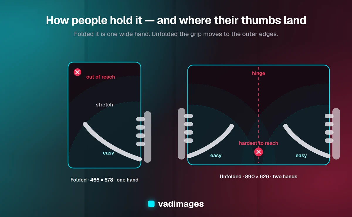
The diagram above is the whole argument in one picture. Folded, the unreachable area is the far top corner. Unfolded, it is the middle — and the middle is exactly where most desktop layouts park their call to action.
Practical consequences for your interface:
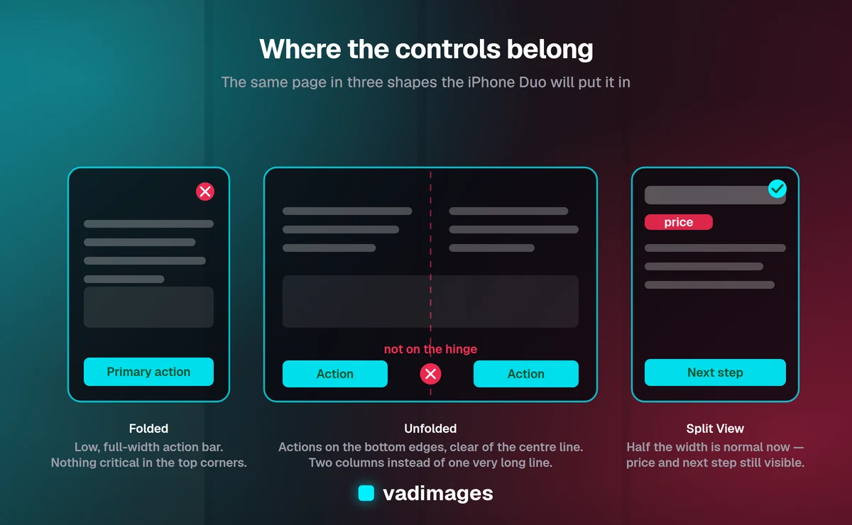
- Move primary actions to the bottom edges. On the wide layout, a sticky action bar that sits low and stretches wide beats a centered button. If you must center something, make it large enough that reach error does not matter.
- Keep the vertical center line clear. The crease is well hidden on this device — Apple used a nano-texture finish to disperse light across it — but it is still a physical seam you can feel. Do not run a critical button, a form field, or a slider handle straight down the middle of the unfolded screen.
- Respect half-folded use. The hinge holds intermediate angles, so people will prop the device on a table like a tiny laptop. Content in the top half, controls in the bottom half is a layout that suddenly makes sense again.
- Raise your touch targets. Two-handed thumb taps on a wide screen are less precise than index-finger taps. Keep interactive elements at 44 by 44 points minimum, with real spacing between them.
- Test left-handed. A layout that puts every action on the right edge works for most people and fails the rest. Symmetry costs nothing.
Split View means your site may only get half the glass
iOS 27 introduces Split View on iPhone for the first time: two apps side by side on the inner display, including two Safari windows for comparison shopping. That last detail matters if you sell anything. Your product page and a competitor's product page will be open next to each other, at roughly half of 890 pixels each, and the one that reads clearly in a narrow column wins the comparison.
So a narrow viewport on a large device is now normal, not an edge case. Two rules follow. First, never gate content behind a "rotate your device for the best experience" message — the user may be deliberately running you in a narrow pane and cannot rotate out of it. Second, make your key facts survive compression: price, what is included, the next step. If your value proposition only lands when the layout is wide, it does not land in the moment where the decision gets made.
Images, type and the things that reflow
Both displays run at a 3x pixel ratio, so assets need to hold up at high density — serve modern formats through srcset and sizes rather than shipping one oversized JPEG and letting a $1,999 phone download it twice as the layout changes.
Give every image and embed an explicit aspect ratio so nothing jumps when the viewport changes; a fold that shifts your content by 200 pixels mid-read feels like a bug even when everything technically worked. Watch line length too: at 890 pixels a single column of body text runs well past the 60 to 75 characters that stay comfortable to read, so either constrain the measure or use the extra width for a genuine second column. And check your hero sections. A full-height hero set to 100vh is 626 pixels of mostly-nothing on the unfolded screen, and it pushes everything that persuades people below the fold — the original fold, the one that has always mattered.
The testing matrix to add this week
You do not need the hardware to do useful work now. Register custom device profiles in your browser's developer tools and walk the critical paths — home, a product or service page, the contact form, checkout — at each of these:
- 466 × 678 (folded, portrait) and 678 × 466 (folded, landscape).
- 890 × 626 (unfolded) and 626 × 890 (unfolded, rotated).
- Roughly 445 × 626, approximating one pane of Split View.
- A continuous drag from 400 to 900 pixels wide with a form half-filled and a video playing — the test that actually finds the state-loss bugs.
Add the two fixed sizes to whatever visual regression or screenshot testing you already run, so the next redesign does not silently undo the work. If you do not have that kind of automated checking in place, it is worth setting up alongside the rest of your ongoing site maintenance rather than as a one-off exercise.
What to do before October 23
In priority order, for a typical business site:
- Fix the money paths first. Contact form, quote request, checkout, booking. Everything else can look imperfect for a week; these cannot.
- Audit the 800 to 950 pixel range. That single band is where most of the damage will be, and it is an afternoon of work to see it.
- Move primary actions low and wide, and get them off the center line of the unfolded layout.
- Remove any rotate-your-device or desktop-only gate still lurking in your code.
- Then invest in container queries for the components that carry your business — cards, tables, forms, navigation. This is the change that pays off for the next device, not just this one.
Frequently asked questions
Will my website actually break on the iPhone Duo? Almost certainly not in a way that returns an error. It will render. The risk is quieter: a layout meant for a tall narrow phone stretched across an 890-pixel screen only 626 pixels tall, an action button where the thumb does not go, or a half-filled form that resets when the user opens the device. Those cost conversions without ever showing up as a bug report.
Do I need a separate site or an app for foldables? No. A separate mobile site was a bad idea when phones were all one shape and it is a worse one now that a single device changes size mid-session. One responsive site whose components adapt to the space they are given handles the Duo, the iPad, the desktop and whatever ships next year.
Can I detect whether the phone is folded or unfolded? Not on Safari today. The CSS Viewport Segments standard that exposes fold geometry is implemented in Chrome and Edge only. On the iPhone Duo you get a viewport size and a resize event, so build layouts that are correct at any width rather than logic that branches on fold state.
How much work is this for a typical business site? For most sites, auditing the 800 to 950 pixel range and fixing the money paths — contact, quote, checkout, booking — is a day or two. Moving to container queries across the components that matter is a larger piece of work, usually folded into the next planned round of changes rather than done as an emergency.
Is it worth doing before foldables are common? The specific fixes pay off immediately on tablets, split-screen desktop windows and small laptops, which are already in your analytics. The foldable is the deadline, not the only beneficiary.
The bigger point
Foldables will not be most of your traffic this year. A $1,999 phone is not a mass-market product on day one. But the people carrying it are disproportionately the ones with budget, and the habits it establishes — resizable viewports, side-by-side comparison, two-handed reading — are coming to the rest of the market behind it. Samsung has been shipping book-style foldables for years; Apple entering the category is what makes web teams finally build for it.
The encouraging part is that nearly everything on this list is good practice anyway. Layouts that flex to their container, components that keep their state, actions placed where thumbs actually are, images that do not jump — these make your site better on every phone, tablet and laptop that already visits it. The Duo just gives you a deadline.
If you would like a second pair of eyes on how your site behaves across those viewports, that is the kind of work we do every week — whether it is a focused audit and fix, a custom build designed to flex from the start, or an overdue rebuild of an interface that was last touched when every phone was the same shape. You can see how we work, look through our recent projects, review what that typically costs, or just tell us what is breaking and we will take a look.